| diary | | | geek interests | | | publications | | | projects | | | web |
The saga of dJsLiM.COM...
I've been working on this Web site since 1995 ... so that's ... wow... 6 years ? I have somewhat of a love / hate relationship with the web ... I hate doing the same thing over and over again... web development / design ends up having that characteristic .. so I hate it, but I really like the interactivity and connectivity the web brings so I love it.. As long as I don't work as a web developer, I'll be fine. ;)
For those of you who've known me for a while will, or maybe not, be able to recall that this is my homepage version 13. Yes... 13 ... *SIGH* ... I'm a junkie... I can vaguley recall the first 2 versions of my homepage that were hosted on CMU's contributed server... This was before Netscape 1.0 became too popular.
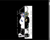
Then there was my homepage version 4 ( to the right ) which got updated when Netscape 2.0 came out with frames support... Being the sucker that I was, I jumped right on the bandwagon. Here I had the two sides, the playful and the serious side ( I think ) ... ^^... I ripped the graphic out of Honey's, my favorite korean hip-hop artist at the time, album. You can notice some Adobe Photoshop filter luvin' on the pages as well. ha ha ha.
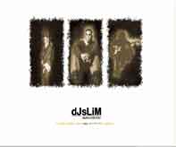
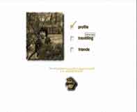
This was my 5th attempt at my homepage... This was a wannabe-designer stage of my life where I thought if I had a lot
of whitespace, and cropped sepia-toned pictures on my home, it'd be elegant and design-worthy... I think I did an
okay job.. what do you think? --;
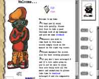
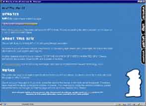
This was my 8th... Version 6 and 7 weren't particularly note-worthy... This is where
I started going crazy with DHTML... Netscape 4 was out and Internet Explorer 4 was out.... Another
band-wagon jumping attempt on my part... If you see on the right hand side, that's a sliding menu..
No it's doesn't really slide, but it pops open when you click on the tab.. Oh, and there was this
Korean artist who sang a song by the title "Sky blue dream".... and I thougt she was hot. keh heh. So,
I started to like this blue color as well... Nope, there's not much depth to it... heh heh
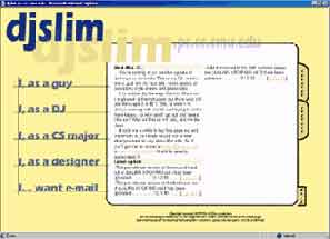
This was my short-lived homepage version 9... Even more crazy with DHTML... the white window
in the middle was actually an absolute positioned layer that dynamically rendered content
depending on how much space they took up, and added "next" buttons to it which will
literally "flip" the page ( coarse animation )... It was short-lived because it required 1024x768
resolution, and it just didn't seem practical at that time... so it got yanked after a week.
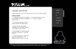
Yet another short-lived design... Version 10 ..This was my attempt at reusing what I had previously, but making
it so that 800x600 resolution can handle it... This still has all the glitters of DHTML, but darker
in color and not as screen hogging as the previous one.
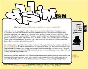
This was my previous design version 12... No DHTML here ...Version 11 had basically the same design as version 12 with
the same DHTML glitter as version 9 and 10, and on top of that it used frames... All that went away in version 12... no frames,
no DHTML... The interesting thing about version 12 is that I actually made my own content management system for it...
I had updates on the "home" page that I could edit/add/delete content to and from via a web-based CMS, and I had also
made a guestbook for it, ... To top all that, it was also internationalized by having all the text in a separate XML file...
It was quite some work to get it all to work, but the fact that I had built the Beijingers' website made it easier for me because by then I had accumulated a huge chunk of ASP code library that I had written for it. That made it much easier for me to do all the CMS work and push forward the internationalization efforts.
